Photography basics - using the camera histogram
One of the basics of good photography is correct exposure. And, to help you, there's a tool waiting to be put to use - the camera histogram.You may not realise it, but almost every camera, and a growing number of smart-phones, include a camera histogram. It might sound technical, but all it is really is a graph (a "histogram") that shows you how well your photo is exposed.
What is a properly exposed photo?
A properly exposed photo will have a full range of tones from the blackest blacks to the whitest whites and everything in between.There are of course situations when a photo lacks some tones intentionally. For example wedding photos often have a lot of bright whites in them which means less space for all the other tones.
- A little bit of background first ... a digital camera can record 256 shades, from light to dark (actually, it records 256 shades of red, green and blue. For the moment though, just think of it being able to record 256 shades from light to dark)
Now, imagine all those shades on a bar graph. Imagine that at one end is pure white and at the other end is pure black. In between there are 256 tones, or 256 bars on a graph. The bar graph we're talking about is the camera histogram.
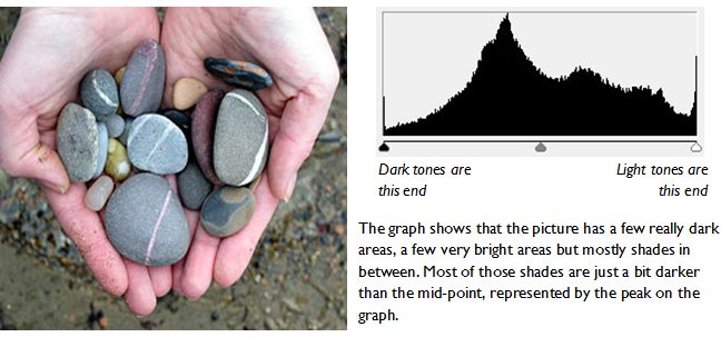
The photo below has its 'graph', or the camera histogram, included. This graph, was taken from Photoshop and shows all the tones in the photo.

The graph shows that the picture has a few really dark areas, a few very bright areas but mostly shades in between.
It's almost a classic 'bell-shaped' curve, which represents a really good exposure.
Why not just leave the camera to sort the exposure out?
A camera will try to expose a scene so that there are some bright whites, some dark blacks, but mostly mid-tones – just like the photo in the example.It will do this by varying one, two or all of three things:
- the shutter speed,
- the aperture,
- the ISO.
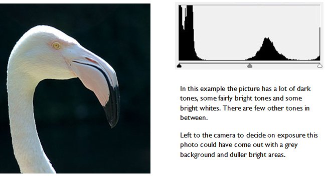
The problem is the camera doesn't know what you, the photographer, are trying to achieve with a particular shot. The photo below, and the camera histogram that goes with it, provide a good example:

A common area where cameras get exposure wrong is where there is a particularly bright scene. Snowy winter scenes and bright sunny beach scenes are classic examples.
In these cases the camera tends to under-expose photos. This leads to a certain greyness to scenes.
So how can I avoid a poorly exposed photo?
There is a way to check if the camera has exposed your photo correctly - use the camera histogram. Your camera will more than likely have the ability to show you the histogram of the image, and you should see a graph like the ones above.Use your manual to find out how to show it on your model – or Google it and I'll bet someone has found it for your camera or phone already!.
If you know that there is nothing unusual about the scene you should expect most of the tones to be around the midpoint and they should peter out towards the dark and light ends of the histogram – the 'bell-shaped' curve.
Read on for an example of how the camera histogram can change, based on three photos of the same scene - one over-exposed, one under-exposed, and one spot on!
Photography basics - the camera histogram part 2 ⇒ ⇒ ⇒
