
August 16, 2007
Welcome to the digital-photography-tips.net monthly ezine.
This month . . .
- A couple of tips on making your tourist snaps stand out from the crowd
- Tutorial on Photoshop Elements Adjust Color Curves tool
- New additions to the site
Photogenic places of the world - #5
New York
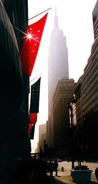 For the photographer New York has a lot to offer. The most obvious subject matter is that gorgeous Manhattan skyline. You just have to take a photo of it! But whats the best angle?
If you get the Staten Island ferry, you get that classic shot of Downtown Manhattan, from across the Hudson River. Nothing wrong with that, but its the same shot every tourist takes.
Heres a good tip so that you can get something a little different look up, as well as forwards.
When you start to look up things look different. I looked up and noticed lots of flags hanging outside Macys.
The flags had holes cut into them, and as they moved in the breeze the sun kept poking through the holes.
Looked good! Now I just needed to get into position so that I had a good backdrop too in this case, The Empire State Building.
Finally I needed to time my shot for a moment when the sun peaked through that flag.
And heres another tip for you many moving objects (such as the flag) move quite rhythmically. Wait, and watch them for a moment. Get the rhythm. Then time your shot. It can make a big difference to your shooting success rate!
Two tips to make your tourist photos look a little different to everyone elses:
- Look up for photo opportunities, as well as forwards.
- For moving subjects, get into rhythm with them, and time your shot!
Photoshop Elements tips and tricks
In this section tips and tricks to help you get the most out of Photoshop. These tips will always be based on Adobe Photoshop ElementsAdjust Color Curves Tool
How to add instant punch to almost any photo add more contrast!
Many pictures lack saturation they could do with a boost to really improve them. Most people would reach for Photoshops saturation tool. But wait! Before you do, try adding some contrast first.
Compare the photos below to see the difference. Photo A is what came out of the camera, photo B has increased contrast.

There are a few methods of adding contrast to photos, heres one of the simplest.
First, open your image in Photoshop. Then go to Enhance, and choose Adjust Color from the drop down menu, and finally choose Adjust Color Curves . . . .
A window will appear showing you six thumbnail images. Choose Increase Contrast - the bottom left corner option.
This will give your photo an instant lift!
If you want to take the effect further, click on the small triangle next to Advanced Options (at the bottom of the Adjust Color Curves . . . window) and four sliders will appear. Play with these to increase or decrease the contrast in your photo.
If you dont own any photo editing software I can highly recommend Adobe Photoshop Elements
Further reading the newest photography tips and tricks!
Heres the latest additions to the site, and a few other highlights, always worth a look . . .- Article on the advantages of digital SLRs
- Photography ebook review
- Digital photography terminology - updated
Help Wanted!
My aim is to share digital-photography-tips.net, and this newsletter with as many people around the world as possible helping the whole world take better photos!If you know of someone who would be interested in receiving this newsletter, please forward this email onto them, and ask them to click here, or send them this link:
https://www.digital-photography-tips.net/Digital-photography-tips-newsletter.html